
Thrift Flip Makeovers Color Guide
📖 Table of Contents
I remember the first time I walked into a thrift store with a paintbrush in hand, expecting to find a forgotten treasure. Instead, I found a dusty chair with potential. It was a simple, weathered piece, but with the right paint and a few hours, it transformed into a statement piece for my living room. That day marked the beginning of my journey into thrift flip makeovers, and color has always played the most crucial role. Choosing the right palette is like unlocking a hidden door — it can make an old piece feel new again, and sometimes, even more valuable.[2]
Color is the heartbeat of any thrift flip. It’s what turns a dull, outdated piece into a vibrant, eye-catching addition to your home. Whether you’re working with a mid-century sofa or a 1970s kitchen cabinet, the right color choice can breathe life into the item. I’ve painted everything from armchairs to entire bookshelves, and each project taught me the same lesson: color can be the difference between a ‘meh’ piece and a showstopper.[3]
This guide is for anyone who wants to explore the world of thrift flip makeovers and understand how color can shape their project. I’ve spent years experimenting with different hues, finishes, and techniques, and I’m here to share what worked — and what didn’t. With this guide, you’ll learn how to pick colors that improve your finds, how to work with existing colors in a piece, and how to create a cohesive look across multiple items. Whether you're a seasoned DIYer or just starting out, this is your roadmap to flipping thrift store finds with confidence and style.[4]
Why You'll Love This Color Guide
- Learn how to match colors to your home’s existing palette
- Discover the best paint finishes for different surfaces
- Get tips on how to work with the colors already present in your thrifted finds
- Avoid costly mistakes by understanding color theory and how it affects your space
Choosing the Right Color Palette for Your Space
As of September 2026, I always start by assessing the room where the thrifted item will go. If it’s a living room with neutral tones, I might lean into a bold accent color. In a kitchen, I prefer muted, earthy tones that complement the overall space. One of my favorite tricks is to take a photo of the room and then test paint colors on my phone using an app like ColorSnap. It helps me see how the color will look in different lighting conditions and how it interacts with the rest of the room.
Another thing to consider is the existing color of the piece itself. Sometimes, the original color is so faded or chipped that it’s hard to tell what it was. In those cases, I’ll use a color matching tool or bring a swatch to a paint store for a custom match. I once had a mid-century dining table that was originally a deep forest green, but after years of exposure, it had faded to a murky brown. Using a custom paint match, I was able to restore it to its original glory, and it looked brand new.
I also like to use the 60-30-10 rule when choosing a color scheme. The dominant color (60%) is the base of the piece, the secondary color (30%) is used in accents or trim, and the final 10% is used for pops of interest. This approach creates a balanced and visually pleasing result without overwhelming the space.[1]
Invest in a color matching tool or take swatches to your local paint store. It's a small investment that can save you time and money in the long run.
Part of our Thrift flip makeovers color style ideas guide.
The Power of Contrast in Thrift Flips
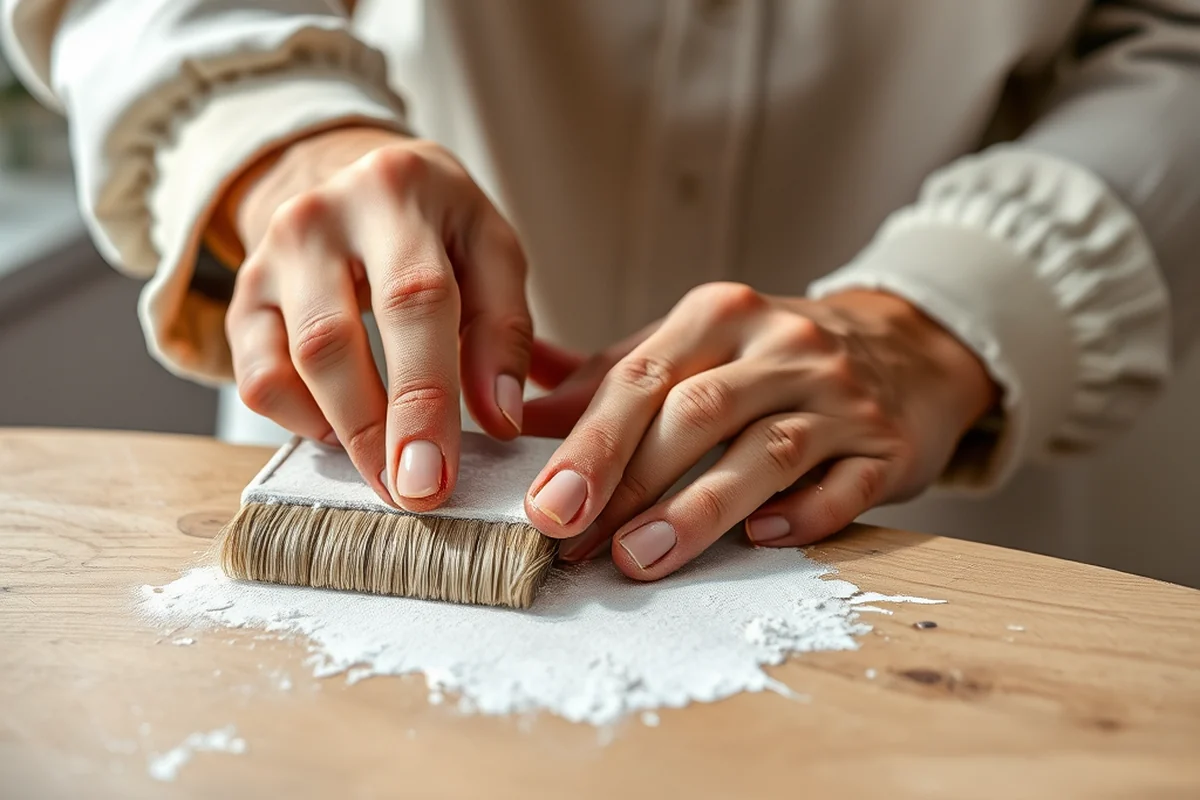
Contrast can be achieved in a few different ways. One of the easiest is to pair a dark color with a light one. For example, I once painted a white armchair with navy blue cushions and it instantly became the focal point of the room. The contrast between the two colors made the piece pop and gave it a modern, sophisticated look.
Another way to use contrast is through texture. I’ve used matte paint on a piece and then added a glossy trim in a contrasting color. This combination adds depth and makes the piece look more intentional. It’s especially effective on pieces with intricate details, as the glossy trim highlights the carvings and adds a touch of elegance.
The key to using contrast effectively is to ensure it doesn’t overwhelm the piece. Too much contrast can make the piece look busy and unbalanced. I always test different combinations on a small area first before committing to the whole project. That way, I can see how the colors interact and make adjustments if needed.
Contrast can be a game-changer — it adds depth, dimension, and personality to any thrifted find.
Related: Thrift flip makeovers color for small spaces
How to Work with Existing Colors in Your Thrifted Pieces
If the piece has a faded or chipped color, I like to use a color matching tool or bring a swatch to the paint store for a custom match. This helps me restore the original color and give the piece a fresh start. I once had a set of 1970s kitchen cabinets that were originally a soft pastel pink. After years of use, they had faded to a dull beige. Using a custom paint match, I was able to restore them to their original color and give them a new lease on life.
I also enjoy working with the colors that are already present in the piece. For example, if a piece has a metal handle in a certain color, I might use that as a guide for the rest of the piece. It helps create a cohesive look and ensures the finished piece feels intentional and well-thought-out.
Sometimes, the original color is too outdated or doesn’t fit the space where the piece will go. In those cases, I’ll use the original color as a base and then add a new color on top for a fresh look. This approach allows me to keep the character of the original piece while updating it to fit the modern home.
When working with a piece that has an existing color, use it as a guide for your new color choices. It helps create a cohesive and intentional look.
“I remember the first time I walked into a thrift store with a paintbrush in hand, expecting to find a forgotten treasure.”— CurbFound editors
Related: Simple thrift flip makeovers style
Painting Techniques That Enhance Color
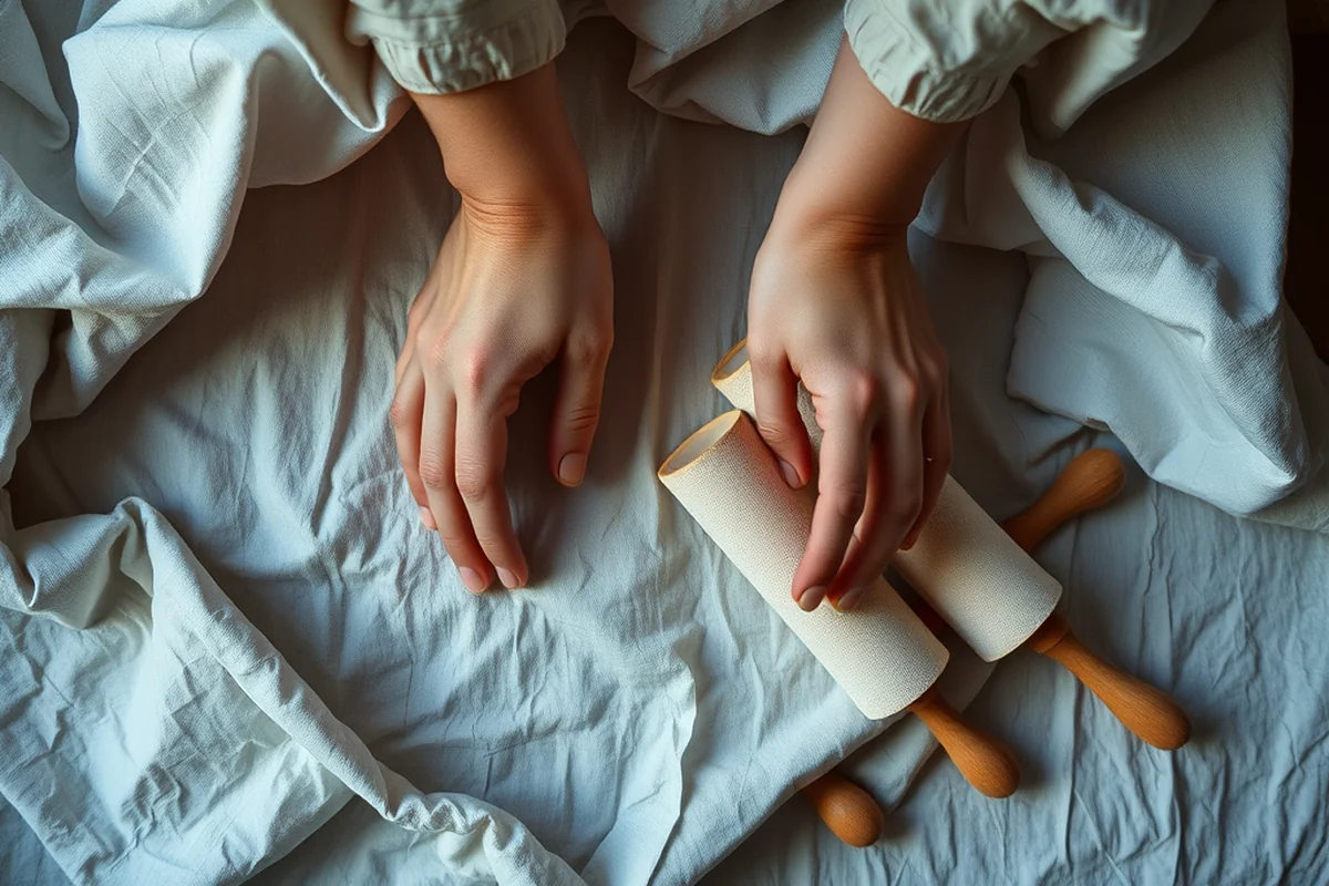
One of my favorite techniques is using a sponge to apply paint. It creates a soft, textured look that’s perfect for pieces with a lot of detail or character. I’ve used this technique on a set of mid-century lamps and it gave them a unique, handcrafted look that really set them apart.
Another technique I love is using a brush to apply multiple layers of paint. This helps build up color and depth, especially on pieces that have a lot of texture or wear. I’ve used this technique on a set of 1950s chairs and it gave them a rich, full-bodied look that really highlighted their original design.
I also enjoy using a dry-brushing technique on pieces with a lot of detail. This involves lightly brushing a dry brush over the surface of the piece, which picks up just a small amount of paint and leaves a subtle, textured effect. This technique is especially effective on pieces with intricate carvings or patterns.
Related: Thrift flip makeovers color checklist
Finishes That Make All the Difference
I always use a matte finish for most of my projects. It’s subtle and doesn’t reflect light, which makes it perfect for pieces that are meant to blend into the background. I’ve used it on a set of living room chairs and it gave them a soft, understated look that really complemented the space.
For pieces that are meant to be the focal point, I like to use a glossy or semi-gloss finish. It adds a touch of elegance and makes the piece stand out. I’ve used it on a set of kitchen cabinets and it gave them a modern, sleek look that really highlighted their design.
I also like to use a satin finish on pieces that are meant to be both functional and decorative. It’s a bit more durable than a matte finish and it’s also easier to clean. I’ve used it on a set of dining room tables and it gave them a polished, professional look that really stood out.
💰 Budget Build
A low-cost version of the project using affordable paints and minimal tools.
⏰ Weekend Version
A quick and efficient project that can be completed in a single weekend.
✨ Upgraded Finish
A more refined version of the project with higher-quality materials and techniques.
🛋️ Small-Space Adaptation
A version of the project that’s ideal for small spaces and compact furniture.
🔒 Rental-Safe Option
A version of the project that’s easy to remove and won’t damage your rental property.
| The mistake | Why it happens | The fix |
|---|---|---|
| Not testing the color in different lighting conditions | Colors can look very different in natural and artificial light, which can lead to an unexpected final result. | Always test the color on a small area of the piece and check how it looks in different lighting conditions before committing to the whole project. |
| Applying too much paint in one go | Applying too much paint in one go can lead to drips, runs, and an uneven finish. | Apply multiple thin coats of paint and allow each coat to dry completely before applying the next one. |
| Using the wrong finish for the piece | Using the wrong finish can affect the overall look and durability of the piece. | Always choose a finish that’s appropriate for the function and location of the piece. Matte finishes are great for living spaces, while glossy finishes are ideal for kitchens and bathrooms. |
| Ignoring the original color of the piece | Ignoring the original color of the piece can lead to a mismatched or unbalanced look. | Use the original color of the piece as a guide for your new color choices. It helps create a cohesive and intentional look. |
Related: Best thrift flip makeovers color style ideas
Thrift Flip Makeovers Color Guide
Related: Best thrift flip makeovers color
Common Questions
Can I use the same color on multiple pieces?
How do I choose the right finish for my project?
What if I don’t like the color I chose?
How do I ensure my paint job looks professional?
References
- ALVERNO - magazine (alverno.edu)
- Looking Good, Feeling Good, Doing Good? (asset.library.wisc.edu)
- Horizontal Networks and Social Equity in Three Cultural Districts (aura.antioch.edu)
- Makeover culture: landscapes of cosmetic surgery - Academia.edu (academia.edu)
Cite this guide
CurbFound (2026). Thrift Flip Makeovers Color Guide. https://curbfound.com/thrift-flip-makeovers-color-guide/
Feel free to cite or share this guide.